


TSA IN THE NEWS

TSA PARTICIPATES IN LIONTOWN 2012
SEPTEMBER, 2012

Exchange
2012
Traditional Home
2011
Ambassador
2010
Dream Homes
2008
Midwest Living
2005
ARCHITECTURAL DIGEST
1990
TSA is a proud sponsor of LionTown 2012, with proceeds benefitting the Children’s Charities Coalition and the Detroit Lion’s Foundation.
LionTown features approximately 100 fiberglass lion sculptures displayed throughout Birmingham, Bloomfield, and the metro Detroit area. Each lion sculpture is uniquely decorated by local artists and designers.
TSA’s lion, named Tom, was designed by artist Andrea Shea and will be on display in front of our office on Woodward Avenue through October.
-Thomas Sebold & Associates
Exchange Volume XXVII, Winter 2012
Central Michigan University College of Business Administration
Dream Builder: CBA alumnus expands on father’s business
As a teenager, Dan Sebold listened to Bob Seger’s music. As an adult, Sebold built his home.
The 1979 business administration major and president of Thomas Sebold & Associates says TSA recently finished Seger’s 30,000-square-foot house in West Bloomfield.
Sebold’s company, located in Bloonfield Hills, constructs approximately 20 high-end homes per year ranging in size from 5,000 to 35,000 square feet. This is in addition to the office buildings, retail centers, country clubs and high-end condominium developments.
As Sebold, a second generation entrepreneur, and his business partner Glenn Kunnath discuss the 1920s architecturally styled home, the wrought iron gates open the Rock and Roll Hall of Fame artist – clad in ripped blue jeans and a black jacket – struts out.
“Hey, Dan, nice to see you again,” Seger says to Sebold. The “Night Moves” then puts his arm around Sebold’s shoulder. “Man, I just love this house. I’ve never lived in anything this well-built before.”
Walking through the home, Seger shows Sebold his lyrics room. “I’m reviewing recordings of the recent tour,” he says pointing to headphones sitting on a desk.
And Seger shows off his family room with floor-to-ceiling windows overlooking the lake. “This room has a view that just won’t quit.”
Sebold says the business connection with Seger happened like so many do – by word of mouth and a building plan that Seger liked.
“I love what I do,” Sebold says. “It is all about the relationships with people. Many people who we build for are now friends. You listen to what they want and deliver. That’s good business.”
Did he picture this success when he was a CMU student?
“I had a different plan when I was at CMU. I wanted to work in business, but I really liked the marketing and advertising side of things. And then my father and I had dinner at the Embers.”
Sitting at the Embers restaurant in Mount Pleasant, Dan Sebold was asked by Thomas Sebold Sr., his father, what he was going to do with his life following his upcoming 1979 graduation.
Dan Sebold told his father – a successful entrepreneur and architect – that he was focused on landing a career in marketing.
“My dad looked at me with a surprised look. Ever since I was in high school, I worked for his company. But he never talked about inviting me into the family business.”
But that day, Dan Sebold’s father spoke to his son about following in his entrepreneurial footsteps. And Dan Sebold told his father that he needed to think about it.
“I knew how tough it would be,” Dan Sebold says.” And I wanted to make him proud by making the right decision for both him and the business. After I thought about it, I called him up and told him that I’d work with him.”
More that 30 years later, Dan Sebold is glad he said yes. And he has done more than OK with the business.
Sebold, who recently celebrated his 30-year anniversary with his wife, Candice, has continued to grow Thomas Sebold and Associates. TSA went from a few employees to a team of 30 professionals. And, in addition to Seger, Sebold’s company has built homes for Compuware Corp. Ceo Peter Karmanos and World Trade Center architect Minoru Yamaskai.
So what does his father, who retired in 1994, think of TSA’s direction?
“I’ve had partners, but no one like my son. He joined on, and we went boom from there. Dan’s taken the business further than I could have ever imagined,” says Thomas Sebold, age 82. “Dan really found his niche in residential construction. Maybe that’s from that marketing he was so interested in.
“I’m so darn proud of him, I tear up. He has done such a wonderful job – he’s a great son and a great businessman. I taught him a little bit, but he’s really taken everything to another level.”
And that is what Bob Seger likes about TSA’s work – the level of quality that Dan Sebold has in his products.
“There is so much attention to detail, so much craftsmanship in this home,” Seger says. “With music, you listen to the recording after a tour to see if there is anything you can improve. I’ve lived in this house for a few months – so you could say that I’ve listened to the recording – and everything’s right on. Solid guy. Solid house.”
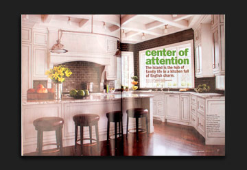
Center of Attention: The Island is the Hub of Family Life in a Kitchen Full of English Charm.
Better Homes and Gardens Special Interest Publication: Kitchen and Bath Ideas
By: Jan Soults Walker | Photographs: Andreas Trauttmansdorff
On any given evening, locating Matt and Kelly Shuert and their three children ages 12 to 15, wouldn’t require a GPS unit. You would, however, need an invitation into their suburban Detroit kitchen, where you’d likely find them, plus a few other family members and friends, gathered around the island – cooking, conversing, working on projects or homework, and having a good time.
“Matt and I and the kids look forward to having dinner together most every evening,” Kelly says. “We cook as a family, and if someone is late coming home, we all want to wait until everyone is present. We’re Italian, and, for us, life happens in the kitchen.”
This irresistible attraction was by design, thanks to the collaborative creative energies of architect Alexander Bogaerts and interior designer Lucy Keena Earl. “We talked at great length with the Shuerts to find out how they cook,” Earl says. “It was important to have a big enough space where everyone could participate, with plenty of storage for cooking supplies.”
A 10-foor-long island is central to the kitchen’s success, providing space for a large group to gather around the perimeter to chop, stir, help with other cooking tasks, offer advice, or sample the results. Once the meal is ready, the long island countertop becomes the serving buffet. For a more formal occasion, an adjacent butler’s pantry provides additional room for preparation as well as cleanup, augmented by a second sink and dishwasher.
As floor plan ideas for the kitchen took shape along with the rest of the new house, the design team looked to a venerable local school, borrowing inspiration from its century-old English-style architecture. “We didn’t want the house to scream ‘new,’” Kelly says. “We wanted everything to look like it had been a part of the property for 100 years.”
To get the look, Earl finished white-painted cabinetry with a gray glaze. Complementary granite countertops feature smatterings of grays and blacks on ivory.
Subtle metallic-finish charcoal gray tiles on the backsplash and walls make a color connection with countertops and provide dramatic contrast with the cabinets. The tiles were selected to pay homage to the Pewabic tiles found in the school and used elsewhere throughout the house. “ Continuing the backsplash tiles to the ceiling is indicative of European kitchens,” Earl says. “But the cost of carrying Pewabic to the ceiling was prohibitive. These are reminiscent of the wonderful iridescent finish found on old Pewabic tiles.”
Balancing the gray tile is dark oak flooring that serves as a gorgeous, warm counterpoint to the dramatic white-painted coffered ceiling – an element that keeps the kitchen feeling light and airy and always enticing to this family and friends.
“I really love the kitchen when the sun is shining through the window over the sink in the morning,” Kelly says. “No matter what we are all doing, this is where everyone come together.”
Hushed Elegance: A Michigan Home is Anything but Ordinary with a Basic Palette and Blissful Details
Traditional Home | November/December, 2011
By: Krissa Rossbund | Photographs: John Bessler
The aesthetic voice of Kelly and Matt Shuert’s Bloomfield Hills, Michigan, home speaks a language of monotone neutrals. But don’t grab a pillow and drift into dreamland quite yet. Spilling from one room to the next, the taupe, ivory, and brown palette is no design snoozer. Instead, the basic hues join forces for a color trifecta that delivers a chick background for elegant entertaining of people parties—occasions where this family of five shines.
From their first discussion in 2001 about building a new house, Kelly and Matt knew that it needed to welcome and comfortably accommodate the people they care about and the celebrations to be enjoyed with them. That included not only family affairs and holidays, but also philanthropic events. Kelly, who began volunteering for Variety the Children’s Charity years ago, now serves as president of the local chapter, and when the need arises for a venue to hold fund-raising events, the Shuert residence often times proves the ideal location.
“Variety is part of our family,” says Kelly. “I love that it’s an international charity with local roots. The money we raise stays here in Michigan and helps a broad scope of needs. My own children are involved with the organization, too, so we all contribute to the community without taking time away from each other.”
Gatherings at the Shuert home can tally upward of 200 people, as at a Variety gala that featured tabletop schemes by Detroit’s leading interior designers. An annual Christmas Eve open house, where Matt, Kelly, and their three teenagers all invite family and friends, also brings in a crowd for festive cheer.
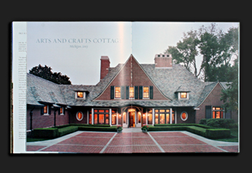
The property on which the new house sits was selected for its proximity to Cranbrook, a national historic landmark in Bloomfield Hills that includes a school for K-12, a graduate Academy of Art, and leading museums. Its idyllic campus of mature trees and architecture is where the couple loved to stroll. Because their children are students at Cranbrook School, choosing the neighborhood was an easy decision, but they first had to find a piece of land that was available. Once something opened up, they built with a design process that proved to be a challenge. They insisted their house appear old and blend in with the Cranbrook style, avoiding attention as the neighborhood’s newest addition. To meet their requirements, Matt and Kelly hired architect Alexander Bogaerts and interior designer Lucy Earl, who worked in tandem to build a structure and subsequent plan interiors that reflected their clients’ vision.
“In the past, a traditional house might have blue in one room, green in the next,” explains Earl. “But with the homeowners’ modern sensibilities, it was more interesting to have a traditional shell with interiors that were quiet and well-edited. This house has threads of browns, grays, and taupes that run through it, with subtle color added by the rugs to give each room it’s own personality.”
The sophisticated dressing of the house all translate into high-impact style and easily embrace the greenery and extra sparkle of Christmas decorations. Luminous velvet and silk fabrics plus twinkling light fixtures exude glamour. Handcrafted rugs in refined palettes and unique fireplace treatments nod to history and heritage. For example, reclaimed petrified wood encases the living room fireplace with rugged texture and also forms the dining room fireplace surrounding. Three generations of the Shuert family paid a visit to Detroit’s 108-year-old Pewabic Pottery to stamp their mark on the home with the individual tiles they designed.
Whether it’s an average day or a special season, the Shuert home welcomes all visitors with open arms and a beautiful visual presentation. “Christmas is an especially meaningful time, when we revisit all our family traditions,” says Kelly. “The open-house ritual started by my parents continues in my home, and friends who do not have family in the area join our clan. We’ve hosted my son’s drum teacher, priests who aren’t giving Christmas Eve Mass, and countless others. It’s a magical time.”
City Slickers: Dan and Candace Sebold go for Big Style in their Suburban Home
Ambassador Magazine | June/August 2010
By: Krissa Rossbund | Photos: Jim Haefner
From the outside, condos often share common traits. But the inside of this Birmingham beauty tells an entirely different story. “Once you walk through that door, you realize you’re in for a treat,” says Eric C. Jirgens, interior designer and owner of Birmingham-based Eric Charles Designs. “We wanted more contemporary, chic living in what is classically a very traditional facade.”
As the designer explains, the homeowners were ready for a change of pace. “They had lived in the suburbs in a rather quiet residential neighborhood,” says Jirgens of Dan and Candace Sebold. “When they moved to the city, they wanted to feel a new experience that would reflect city living. It had to be current in one respect and timeless in another. They didn’t want to invest in a fad or a phase.”
Instead, he says, they were looking for something with cleaner lines that was visually simple but warm, as well as surroundings they could feel good in every day. It certainly helped that Dan Sebold, president of Thomas Sebold & Associates in Bloomfield Hills and Petoskey, was not only the homeowner in this case but the builder, too.
Though Sebold has been in the business for more than 30 years, this was the first home he had built for himself. He learned a great deal from the experience, and he can’t say enough about Jirgens and his impeccable taste. But perhaps the biggest compliment is that he and his wife find it difficult to pick a favorite room because they enjoy each one immensely.
An elevator provides easy access to all three floors of the condo that includes a lower level and second floor master. Since Jirgens collaborated with Sebold on this project, a number of custom elements were added to the 5,600-square-foot structure that features some soft deco influences and luxurious materials like the stainless steel spindles along the sweeping staircase.
“It doesn’t live big, even though it has a lot of square footage,” Sebold says of the compact footprint. “We use all of the rooms.”
The distinctive details make a statement, such as the mix of high-gloss lacquer on the woodwork and doors covered in a low-luster black finish with polished nickel hardware. “They almost become a negative space,” Jirgens says. With a few exceptions, the floors are done in wide plank walnut with a darker stain. The walls are painted in soft hues, like the bluish-gray in the living room and the wheat color found in the hallways.
The art that was selected for the home includes three Jimali originals. “The earthy images contrast with the woodwork and hardware,” Jirgens explains. “The artwork brings about this very human quality. It’s lovely to contrast these with slicker interiors.”
The lower level boasts a billiard room, media room, wine cellar and bar. The crisp, clean billiard room features a fireplace and grass cloth walls. Carpeting helps with acoustics, while a drink shelf on the wall comes in handy when shooting pool. “It’s a very simply furnished and straightforward room,” says the designer, who provided plenty of space to maneuver the cues.
For the media room, the goal was easy living for entertaining for alone time. The leather sofa and ottoman are low-maintenance and low-key. A big screen TV and power-operated draperies make it a dark and proper room for movie watching, says Jirgens, who designed a walnut cabinet with an Asian influence for the space. The carpet absorbs sound while adding comfort underfoot.
The wine cellar is a real show stopper. “They really wanted to showcase their wine collection,” Jirgens says. “I didn’t want it to be a room down the hall that was a destination.” His solution was to feature the impressive selection of wines behind an enormous plate glass window that can be seen by everyone at the bar and beyond. The bottles are stored horizontally to show the labels instead of the corks.
The walnut walls and bar create a continuos flow, while the stone floor contrasts with shades of cream, yellow, and a touch of rust. An antique galvanized steel table with stools that can be stowed underneath was originally intended for a potter’s shed. Now, it serves as the perfect spot to open and enjoy a bottle of wine.
On the main level, the living room beckons with welcoming tones of grey and gold. A fireplace adds another layer of luxury to the sumptuous surroundings. “It’s bright and refreshing. Incredible afternoon light fills the space,” Jirgens says. “This room is so easy to sit in. Although it is not a very large room, it manages to seat many people comfortably.”
A nearby screen porch features radiant heated bluestone floors that make the room usable almost all year round. Wicker furniture with indoor-outdoor fabric mingles with candle lanterns that hang from above. “It is absolutely romantic and soft,” Jirgens says. “It’s really a cozy space.” A teak and metal cocktail table round out the room.
The dining room dazzles with its octagonal shape and dramatic design. Some sections are covered with smoked mirror while others feature fabric with built-in consoles. Armchairs take on a sculptural quality with their distinctive architectural shape. Leather seat cushions contrast with the lovely upholstery. “They use this room all the time,” Jirgens says.
The kitchen is another popular spot for the homeowners who love to cook and entertain. Glass front cabinetry with mahogany interiors is one of many highlights in the mostly white environment. Glass pendants hang above the island, which looks more like a deluxe table, thanks to a three-inch thick walnut chop block countertop. “It provides a lot of strength and warmth in the middle of the room,” Jirgens says. A coffee bar connects to the kitchen while the adjacent hearth room visually expands the space.
Upstairs, the master bedroom is perched high above the ground. Windows provide lovely outdoor views while the fireplace offers a natural focal point. Clean-lined furnishings complement more unique pieces like a Tibetan hand-knotted rug and antique French lamps. The walls are painted a soft blue grey with green undertones. “It really changes with the light,” Jirgens says.
“With a smaller footprint, the color palette became really relevant, the designer says. The lack of windows on an entire elevation posed another challenge. But Jirgens was able to overcome all obstacles. He credits Sebold for his extensive knowledge and high standards. “He already had high expectations for his dream house,” says the designer, who was grateful for his client’s expertise and topnotch tradespeople.
As the pros so deftly demonstrate, quality trumps quantity every time. “Once you close those doors, it’s a cocoon, a real retreat in downtown Birmingham,” Jirgens says. “It’s not enormous and it doesn’t need to be. I call it a jewelry box. It has all of the spaces functioning and finishes are beautifully executed.”
Rubin Residence, Bloomfield Hills, MI
Floor Area: 603,870m²
Architect: McIntosh Poris Associates
By: Nicki Xiao | Photographed by: Kevin Bauman
The architects at McIntosh Poris Associates positioned this 6,500-square-foot residence on less than an acre of triangular land. With half of the house situated in the ravine, it was the client’s desire to bring nature into the home, while blending the building and nature into the home, while blending the building and nature into one. The architects designed a function and easy-to-maintain, stylish home with a non-traditional floor plan—the perfect showplace for these fabric entrepreneurs!
From the street, the house appears to be a single-story ranch home surrounded by lush landscaping. The three-car garage and solid front wall leading to the main entrance provide the home privacy by its orientation toward the street.
Dream Homes Michigan: An Exclusive Showcase of Michigan’s Finest Architects, Designers and Builders
Thomas Sebold & Associates, Inc.
By: Paul Young | Photographs: Balthazar Korab
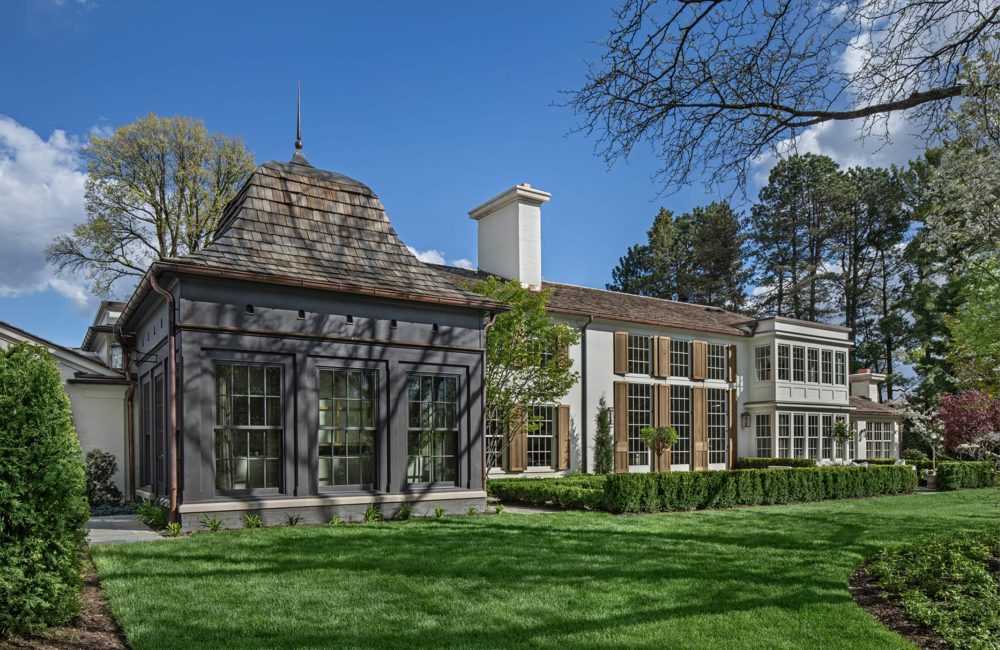
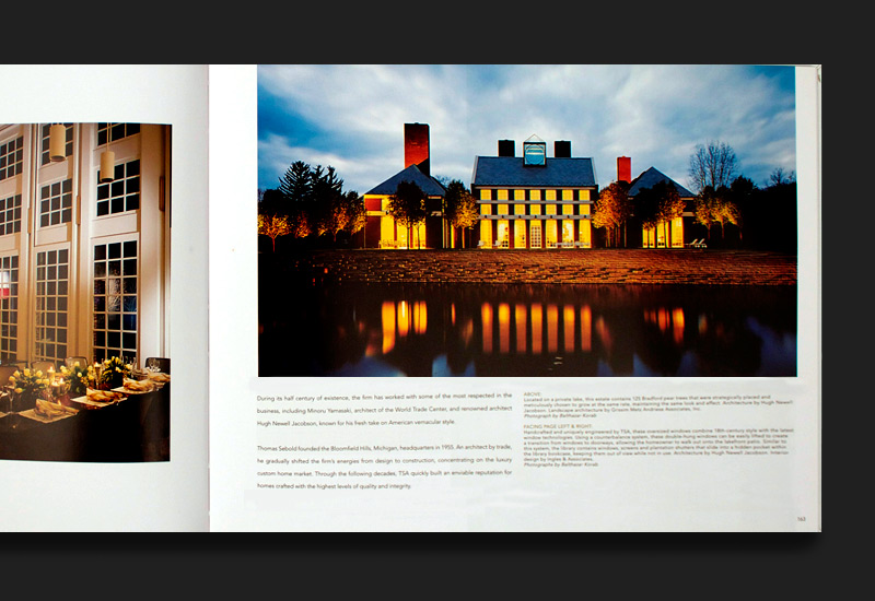
Photo caption 1: ABOVE: With simple, elegant interiors and expansive windows, this 18th-century-style home, replicating those located along the James River in Virginia, is a modernized and contemporary Michigan classic. Interior design by Ingles & Associates. Photograph by Balthazar Korab
FACING PAGE: This Bloomfield Township estate emphasizes neoclassical design characteristics with repeated use of proportion and grace. The use of large but simple geometric shapes reflects this new-age classic design. Architecture by Hugh Newell Jacobson. Landscape architecture by Grissim Metz Andriese Associates Inc. Photograph by Balthazar Korab
Photo caption 2: ABOVE: Located on a private lake, this estate contains 125 Bradford pear trees that were strategically placed and meticulously chosen to grow at the same rate, maintaining the same look and effect. Architecture by High Newell Jacobson. Landscape architecture by Grissim Metz Andriese Associates, Inc.
FACING PAGE LEFT & RIGHT: Handcrafted and uniquely engineered by TSA, these oversized windows combine 18th-century style with the latest window technologies. Using a counterbalance system, these double-hung windows can be easily lifted to create a transition from windows to doorways, allowing the homeowner to walk out onto the lakefront patio. Similar to the system, the library contains windows, screens and plantation shutters that slide into a hidden pocket within the library bookcase, keeping them out of the view while not in use. Architecture by Hugh Newell Jacobson. Interior design by Ingles & Associates. Photograph by Balthazar Korab
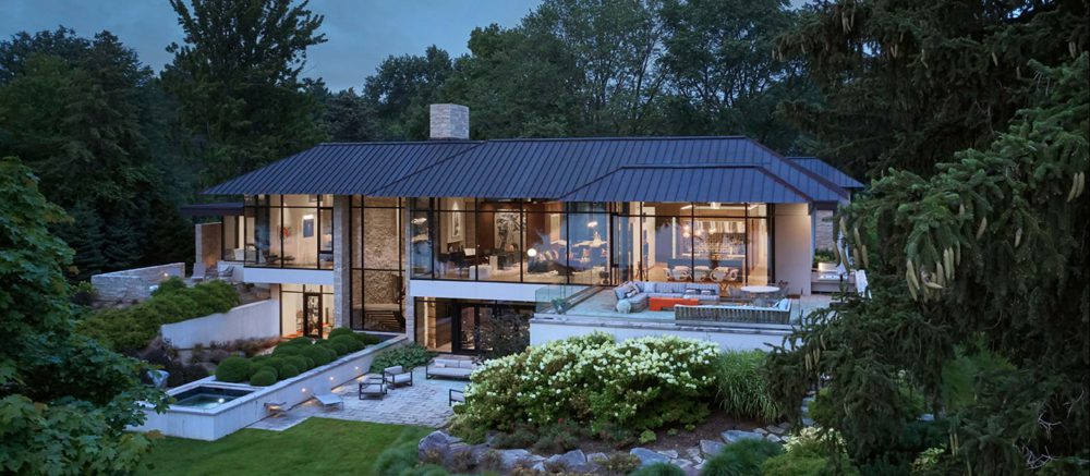
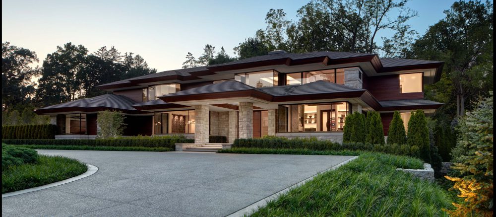
Photo caption 3: TOP & BOTTOM LEFT: Intending to blend in with the landscape and appearing to grow out of the ground, this Frank Lloyd Wright-inspired estate has oversized mahogany eaves and a low pitched Bermuda copper roof. The spacious living room features gold leaf ceilings, limestone columns and the use of numerous wood veneers. The fireplace incorporates unique materials like sapele and ebony woods in addition to bronze and stainless steel details to create a focal point. Architecture by Luckenbach I Zeigelman PLLC. Landscape architecture by Grissim Metz Andriese Associates, Inc. Photograph by Balthazar Korab
FACING PAGE LEFT & RIGHT: Use of Fond du Lac stone in the exterior design as well as the interior spaces is one of the many uses of nature throughout this Birmingham home. Horizontal bands of mahogany-framed windows are also a continuous element used in the Zeigelman PLLC. Interior design by Eric Charles Design. Photograph by Balthazar Korab
Photo caption 4: LEFT: This northern Michigan home incorporates numerous large windows, capturing 180-degree views of Bay Harbor Lake and Lake Michigan beyond. A boathouse adjacent to the dock allows the homeowner to conveniently store a yacht up to 45 feet long. A window wall visually connects the living room to the boathouse, showcasing the owner’s yacht. Architecture by Young & Young Architects. Photograph by Balthazar Korab
Photo caption 5: RIGHT: Bold colors, high-quality materials and dynamic forms, combined with endless views, make this home a summertime dream getaway. Architecture by Young & Young Architects. Landscape architecture by Vidosh Landscaping Centres. Photograph by Balthazar Korab
FACING PAGE: Easy boathouse access makes this living room ideal for entertaining friends and family during summertime Michigan getaways. Warm colors, soft finishes and comfortable furnishings welcome guests to walk off the boat and into the living room. Architecture by Young & Young Architects. Interior design by Pace Interior Design. Photograph by Balthazar Korab
Photo caption 6: ABOVE: This northern Michigan home situated in Bay Harbor is an exquisite example of balance and symmetry. Architectural features, landscape placement and prominent front entry showcase the home’s individuality. Architecture by Alexander V. Bogaerts + Associates. Landscape architecture by Vidosh Landscaping Centres. Photography by Michael Buck Studio. FACING PAGE: Panoramic lake views offer a strong connection to the surrounding landscape with Lake Michigan to the north and Bay Harbor Lake to the south, rich wood tones and natural materials create a warm and comforting environment for this vacation retreat. Interior design by Caryn Satovsky-Siegel. Photography by Michael Buck Studio.
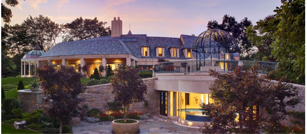
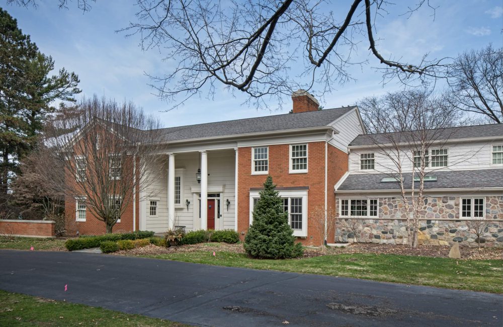
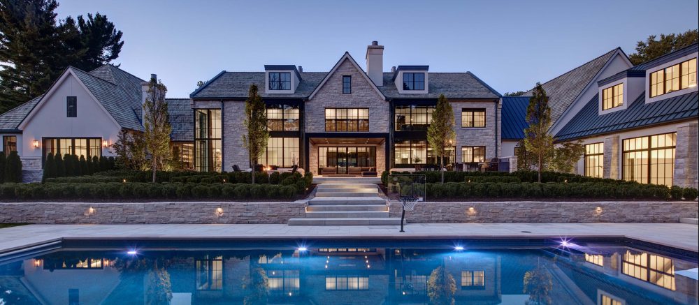
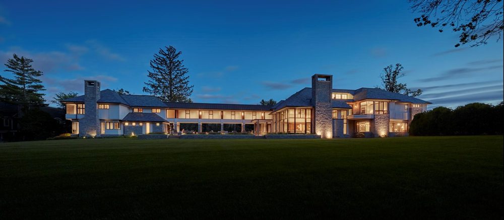
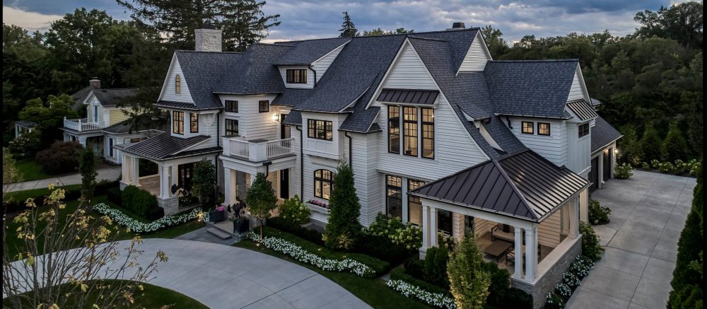
Thomas Sebold & Associates’ client list includes some of the Great Lakes States’s most prominent business owners and professionals. Respected interior designers, architects, celebrities and other well-known residents live in Sebold-built homes. From Oakland Country’s contemporary masterpieces and elegant traditional estates to waterfront retreats along Lake Michigan, the company’s influence is far-reaching and felt throughout the state.
Collectively, the TSA team builds approximately 20 high-end homes per year ranging in size from 5,000 to 35,000 square feet. While custom estates are TSA’s specialty, office buildings, retail centers, country clubs and high end condominium developments are other projects that have been added to the team’s successful history.
During it’s half century of existence, the firm has worked with some of the most respected in the business, including Minoru Yamasaki, architect of the world Trade Center, and renowned architect Hugh Newell Jacobson, known for his fresh take on American vernacular style.
Thomas Sebold founded the Bloomfield Hills, Michigan, headquarters in 1995. An architect by trade, he gradually shifted the firm’s energies from design to construction, concentrating on the luxury custom home market. Though the following decades, TSA quickly built an enviable reputation for homes crafted with the highest levels of quality and integrity.
Thomas Sebold & Associates still bears its founder’s name, even though Thomas’ son, Dan, took over the reigns of the company in 1994. As president and principal, Dan carries on the family’s legacy by personally overseeing each project to ensure that it is built to TSA’s exacting specifications and expectations.
Dan’s continuing leadership has given Thomas Sebold & Associates a reputation and client list that is second to none in the high-end custom residential market. His eye for detail and his vast knowledge of building materials and techniques have enabled him to set and, more importantly to meet the highest quality standards for the company. Dan’s acute awareness of alternative building materials and techniques has also enabled him to create innovative engineering solutions without compromising design intent or architectural integrity of budget-sensitive projects. His hands-on approach and involvement with each project throughout its duration is unsurpassed in the construction industry.
Throughout the years, Dan has overseen the construction of hundreds of distinctive, high-end homes while guiding the growth of the company. TSA’s talented team currently includes 30 dedicated and talented professionals. In addition to the Bloomfield Hills headquarters, a northern Michigan office was opened in 1995 to oversee the development of the 30,000-square-foot, mixed use Bay Harbor Yacht Club. The new office represented a natural progression from the firm, and the first of a growing collection of projects in the near Petoskey area remains an important part of the company’s strategic goals.
In 2007, long-time employee Glenn Kunnath joined Dan as partner, vice president and director of field operations. “Glenn has been with the company for more than 14 years and has been a major contributor to our success since joining TSA,” Dan says. “He started as a project manager, moved up to vice president and is now partner. He has held every possible management position through his construction career. Glen has proven the ability of maintaining schedules, budgets and lasting client relationships. He is an expert at delivering a project on time and on budget. Glenn is highly organized, excellent in the field and an overall credit to the company.
With 35 years of construction experience, Dan stands firmly behind TSA and the company’s unwavering commitment to quality. Through their personal involvement in the construction process, Dan and his team build lasting relationships with their clients.
“TSA has built its reputation by insisting on the highest standards in the business. We’re proud of out attention to detail and out passion for excellence,” Dan says. Wherever the location, TSA’s goal is to make those qualities the cornerstone of each and every home it builds.
“I am honored to continue the tradition started by my father over a half a century ago,” Dan says. “The majority of our business comes from referrals and former customers. We feel these referrals speak volumes about out work and honor my father’s legacy. We’ve been involved in the construction of some amazing homes, but after 50 years we still believe that the most enduring thing we’ve built is our reputation.
Easily Entertained: An open kitchen draws family and guests to the heart of a Michigan home.
Midwest Living April, 2005
By: Gisela Rose | Photographs: James Yochum
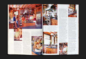
The driving Desire behind the design of Debbie and Joe Nachtrab’s Bay Harbor, Michigan, kitchen sounds more like the goal for a traditional family room than a workroom for cooks. “I want people around me,” says Debbie, a mother of three, grandmother of three and an avid cook. “I don’t want to be secluded from the rest of the house.”
Her kitchen’s setup ensures that won’t happen. A large opening in the wall lets conversation flow between the kitchen and the dining area. Quarter-sawn white oak cabinetry and reclaimed chestnut ceiling beams create the warm feel of a living room filled with furniture. A Large central island with a prep sink invites friends and family members to gather and lend a hand when meal prep is underway.
This heart-of-the-home approach to kitchen layout reflects the wishes of many modern homeowners. Most of us want to chat while we cook – with family during homework time, with friends dropping by and with guests during get-togethers large and small.
Indeed, it’s hard to keep people out of the kitchen with its warmth and aromas and the bustle of the cook’s activity. If a kitchen isn’t set up to handle a crowd, it’s guaranteed to feel crowded. That’s why Debbie chose a design that lets her kitchen function all at once as a cooking center, a dining space and an entertainment hub. You can do it, too.
Seldom-used dining room, for instance, could become a cozy sitting room off the kitchen after the removal of the dividing wall.
Even with an open kitchen, the counter design determines how well the cook can communicate with guests. “It’s so important to have an expanse of counter-top facing the guests, so the cook can preparing or serving from that area without having her back to the guests,” says Certified Kitchen Designer Liz Firebaugh of Petoskey, Michigan, who worked with the Nachtrabs on their kitchen, A two-tiered island counter-top design is an effective way to hide a chef’s mess from guests.
A freestanding island in the center of the kitchen is a perfect interactive workstation for chefs. Many designers strongly believe in putting the cooktop in the island to make sure the cook is facing out when cooking rather than facing the wall. The Nachtrabs use their large center island for the buffet-style serving they do at all their Parties; the large commercial-style stove is located along the wall.
Debbie welcomes help when she cooks, so she designed her kitchen to make that possible. “I wanted a lot of workstation,” she says. For instance, she placed the island’s salad sink far from the stove so the salad preparer doesn’t trip up the pot stirrer. The sink is deep and equipped with a garbage disposal to handle a wide range of tasks.
For kids who like to help in the kitchen, pull-out boards and stop stools are handy ways to put counter-tops in reach. Some kitchens include at least one section of counter-top that is lowered from the standard height of 36 inches to around 30 or 32 inches. In addition to accommodating kids and shorter cooks, lower counter-tops are ideal for rolling out dough.
For those guests not chopping salad or rolling out biscuits, there should be lots of seating near but not in the cooking area. The Nachtrabs’ long seating bar offers several bar stools overlooking the kitchen action. Just beyond the bar, the home’s grand hall holds a table that seats 14. Cozy upholstered furniture is increasingly popping up in corners of many kitchens. If homeowners tend to eat at the bar rather than the table in an eat-in-kitchen, they may be able to replace the table with a slip-covered couch or a couple of deep armchairs.
If you’re building a new kitchen or doing a major remodeling job, fill the room with tunes by adding ceiling speakers. Need a simpler solution? Install a sleek under-counter CD player. To avoid drowning out the music or sparkling conversation, look for the quietest dishwasher available.
It’s hard to beat a coffee shop’s ambiance for friendly gatherings, which helps explain the surging popularity of home espresso machines. Touching one of these units under a cabinet brings the unmistakable aroma and whooshing sound of coffee bars into your kitchen.
Choose lighting that’s versatile enough to help a kitchen’s mood melt from hardcore cooking to evening gathering. When food is being served, softer lighting is best. Under-counter lights and task lights focused on food prep areas can let you keep serving as you dim the overall room lights, creating a more romantic glow.
If you tend to use your kitchen as a substitute living room, why not decorate that way? Use artwork, furniture and displays of collectibles to create the sense of a casual gathering area.
Traffic control is essential for kitchens where people gather. Keep guests out of the main traffic lanes by installing a mini-fridge, ice maker and other beverage accessories on the kitchen’s edge, letting people grab their own drinks without getting in the host’s way.
Photo Caption 1: Easily Entertained. (Above) Quarter-sawn oak cabinetry creates a welcoming atmosphere in the kitchen of Debbie (in striped shirt, at end of island) and Joe Nachtrab (in green shirt)
Photo Caption 2: Easily Entertained. (Above) Dual ovens speed party prep. (Above right) A white tile back-splash keeps the coffee area bright. (Below right) Casual gatherings often center on the large central island.
Palladian Abstractions: Hugh Newell Jacobsen’s Light Washed Design in Michigan
Architectural Digest December, 1990
By: Robert Cambell | Photographs: Balthazar Korab
“We didn’t want anything old-fashioned, anything with a lot of wood,” comments one of the owners of a house outside Detroit. By so saying, he defines two opposite kinds of architecture. There is the woodsy house, which wraps you up in a warm, fuzzy, rich blanket of texture and color. And then there’s the clean-as-a-hound’s-tooth house, as trim as a ski and as taut as a sail in the wind. It’s the latter that has always appealed to Washington, D.C., architect Hugh Newell Jacobsen, who has spent years refining the concept.
The Michigan residence he designed, for a real estate developer and his wife, is typical of Jacobsen, filled with the architect’s trademark: spare, sophisticated detailing, There are, for example, no baseboards where the walls meet the floors. The bookshelves in the library are elegant egg crates with edges that seem as thin as knives. Televisions are hidden in the walls; the one in the master bedroom rises out of an innocent-looking table at the touch of a remote switch. Air-handling grilles are crisply ornamental slots in the wall or floor.
In a Jacobsen house, much of the pleasure is of a monastic kind. It is the pleasure of a world without clutter. The result, among lakes and rolling woods in Michigan, is crisp and clean, ” a house with architectural character, ” says the husband. For those who enjoy a somewhat stately, formal way of life, and especially for those who love to entertain – as do the house’s owners – it’s a dream of an airy paradise.
Jacobsen often remarks that every house ought to contain one good shock, a place where one stops short in amazement. In this house, that place comes at the climax of a carefully orchestrated sequence that begins with the approach to the house, a narrow, twisting, semi-rural road. From the road peels an inconspicuous gravel driveway, which suddenly becomes an avenue, aiming straight through an allee of pear trees towards the front door. By directing the visitor’s view, the enclosing pear trees disguise the fact that the site is less than vast. “I grabbed every vista I could to give a sense of a thousand acres instead of two and a half,” admits Jacobsen. Seen from the allee of pear trees, the house is formal and symmetrical, but not (so it seems) very big. “I always manipulate scale in my work,” the architect says. “The ambiguity is rather fun.” After passing through a number of smallish spaces-an entrance pavilion, a vestibule and a narrow, pitched-ceiling hallway visitors are confronted with a breath-stopping explosion of light and space that is the Great Room, with a wall of windows framing a spectacular view of lake and island.
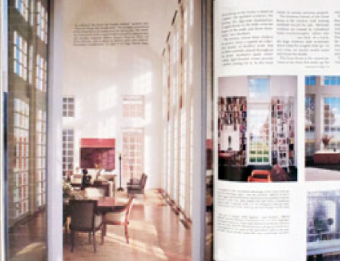
The Great Room is the heart of the house. It is twenty-one by forty-two feet- a double square, half for living and half for dining, with two identical fireplaces. The neatness of the arrangement is a clue to a hidden order; “Everything in the house is based on a square – the gridded windows, the flooring, the egg – crate bookshelves, the glass blocks in the bath, even the shapes of the walls and floors themselves,” says Jacobsen.
The owners, whose three children are grown, have a superb art collection, mostly of modern work, that has been carefully placed throughout the house. Jacobsen’s quite, white-walled, light-floored rooms provide a perfect setting for it. In the Great Room, Tangerine Moon and Wine Dark Sea by the American artist Milton Avery hangs prominently in the living area. A Hans Hofmann is mounted over the fireplace in the living area, and an Alexander Calder sculpture rests on a table. The furnishings are relaxed and eclectic, some reminiscent of the early-modern designs of the Cranbrook Academy of Art, which is situated only a few miles away. Interiors consultants were Ingles & Associates, headed by David Ingles Goldburg, who worked with the clients on several previous projects.
The knockout feature of the Great Room is the window wall looking southeast toward the lake. Alternate windows are framed by cylindrical brass counterweights, rather like those of a tall case clock. At a touch, the huge windows slide noiselessly down while the wights slide up – or vice versa. An electric switch raises and lowers the shades.
The Great Room is the central pavilion of the three that make up the whole structure. Seen from the driveway or the lake, the house appears to be a simplified abstraction of a great eighteenth-century plantation house, like those along the James River in Virginia. Jacobsen says it also owes something to the British architect Sir Edwin Lutyens, whose British Embassy in Washington, D.C., displays similar eighteenth-century themes. Like those precursors, the Michigan house consists of high brick center pavilion featuring a prominent roof and tall chimneys, with symmetrical lower wings at either side joined by what Jacobsen calls hyphens – connecting links or passages made of glass. “It’s like going outside before you get to the next space,” he says. Both the James River house and this one in Michigan derive from the work of the Italian Renaissance architect Palladio, who was the first to organize ordinary farming villas in to small symmetrical palaces.
Jacobsen does to his eighteenth-century models what he does to everything he touches: He abstracts them, strips them of clutter and ornament, makes them flatter, thinner, more diagrammatic-creating, in this case, a sort of refines Platonic ideal of a Colonial plantation house.
Jacobsen has taken other ideas from the plantation model. Windows and doors are placed so they can be opened to let the breeze flow through, which is especially effective since there are lakes on both sides. And just as with the plantations, you can walk out form the house across a terrace and a garden to a limestone stepped battered wall, designed by landscape architect John Grissim, and board a boat for a ride on the water.
The house’s basic materials are salmony red bricks, pale green slate for the roof, limestone trim and copper downspouts. “The spouts will eventually turn the same color as the roof,” Jacobsen says. The entrance courtyard is paved in granite blocks in a fishtail pattern banded with slate, and the front terrace is slate. Indoors, walls are simple drywall or wood cabinetry, always painted white, and floors are carpet or marble or oak in a herringbone patter.
Jacobsen often likes to pull a house apart into separate pavilions that can be sharply defined. Doing so gives him an opportunity to emphasize crisp shapes and flawless joints he loves. Thus the three-pavilion plantation form works well for him. In the Michigan residence, the two side pavilions appear to be identical to each other, but in fact they are similar boxes with very different contents. One side holds the master bedroom, a library and an upstairs exercise room and study. The other contains the kitchen, a solarium and a three-car garage.
Of all those spaces, the library is perhaps the most successful. The grid of bookshelves seems to climb to the clouds, and it plays gently against two other white grids: an even taller door-plus-window looking out to another pear tree allee and a ladder leading to the upper shelves. There’s delight in the way the architect plays with these elements in a small room. Good architecture – like any other form of civilized endeavor – should treasure and remember the past but at the same time be infused with the joy of experimentation and innovation. In translating a traditional American type of house for owners with contemporary needs, Hugh Newell Jacobsen has struck the difficult balance that is civilization.
Photo Caption 1: Preceding pages: A lakeside residence near Detroit designed by Hugh Newell Jacobsen for modern-art collectors is a contemporary version of James River plantation houses. “I used the eighteenth-century trick of breaking the house up into five parts,” says Jacobsen. Outdoor furniture from knoll. Above: The structure’s three pavilions front a granite-paved forecourt.
Photo Caption 2: Above: The connecting link, or “hyphen,” leading to the Great Room features reflective floor-to-ceiling glass and verde giada marble floors. “During the day, nature is a strong presence there,” says the architect.
Photo Caption 3: “The house seems designed for our collection,” says the husband. Above: The pitched-ceiling hall acts as a gallery and provides a longitudinal connecting axis. At left, works by Robert Motherwell and Milton Avery.
Photo Caption 4: “We chose David Ingles Goldburg of Ingles & Associates to help with the interiors because we knew he’d be sympathetic to the design,” says the husband. The Great Room is distinguished by a double-height gridded window wall overlooking a lake. The brass-counter-weighted window can be raised to provide access to the outdoors. Art Deco armchairs are grouped with tuxedo sofas in the living area. African figural harps are displayed on the low table, and a 1970 Lichtenstein bronze stands between the living and dining areas. Ushak carpet.
Photo Caption 5: “I wanted to take maximum advantage of the views and capture the Michigan light,” says the architect. Above: In the library, egg-crate bookshelves complement the gridded windows. Beyond, a pear tree allee frames the lake view. A Ruhlmann game table is paired with a T. H. Robsjohn-Gibbings chair. Small Mother and Child, 1962-63, by Sorel Etrog is on the shelf.
Photo Caption 6: “The eye is happy with squares,” says Jacobsen. Above Right: Jose de Ribera’s Construction No. 154, 1973, highlights the master bedroom. Chair and ottoman from Kreiss; cotton on bed, Lee Jofa. Right: Round Jacobsen-designed mirrors are a counterpoint to the grid of the glass-block walls in the master bath. Brass fitting accent the onyx counter tops and floor.
In-photo Caption: “As collectors the clients are visually attuned,” Jacobsen says. “They see things other people miss.” The Georgian proportions of the Great Room are visible from the dining area. The rhythmic fenestration of the window wall is echoed by balanced door and window elements. Milton Avery’s Tangerine Moon and Wine Dark Sea, 1959, is above an African mask and a turn-of-the-century weather vane. At right is an Edgar Brandt lamp.


